
1) A3 Size. Acrylic with water on cartridge. This was one of the first larger investigative studies I completed upon first discovering I felt drawn to representing the human figure. The image was taken from an online figure drawing class at the stage I was unable to attend a life class with live nudes. Initial studies were made in my sketchbook and a further development was eventually created in black and white charcoals on sand cartridge. For this painting I aimed to capture the complex tones of the figure but, in contrast, using very basic washes of acrylic. (http://artists.pixelovely.com/practice-tools/figure-drawing/)

2) A4 size. This was also taken from the website stated previously. I initially experimented with ink, ink and water, and also a water-covered background with ink drawn on top. After many examples of experimentation I decided to create a final developmental piece. I painted water over only the contour and positive shape of the figure in small sections at a time, before using a small paintbrush to apply ink to the darker areas shown in the image of the model. The ink would then bleed in a random fashion over the image. Again I wanted to convey the different levels of tone but by using a less conventional, more precarious method of application.

3) A3 size. Again, taken from the figure drawing website prior to being able to access a life-drawing class, this painting began as initial sketches and investigative studies both within and outwith my sketchbook. I experimented with ink in the same way as the previous picture, attempted some initial ideas of sculpture that will eventually lead to some final sculptural pieces, and amidst them used white watercolour and painted straight onto blue sugar paper. I aimed to loosen up my painting and move away from mark-making prior to adding paint.

4) These
were created at my weekly Portfolio Preparation course at Glasgow School of
Art. An initial theme we covered was ‘colour’,
where we worked from an installation consisting of colourful objects. Lower Centre: (A2, acrylic) capturing
interesting parts of the installation in frames. Top Left: (A2,
watercolour) 5 minutes to capture an area of the installation using as
realistic colours as possible. Top Right: (A2, chalk) A 'backwards-blind-drawing',
disconnecting hand-eye coordination to loosen up drawing and take away the control
element. Top centre: (A3, chalk) quick observational drawing using
realistic colours. Sketchbook items (A5) – personal analysis of colour outwith
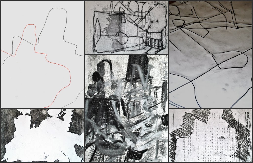
class.

5) A second theme explored at the course was ‘multiples’. After choosing an object considered a ‘multiple’, (I chose cotton buds) we worked with it in various ways. Bottom left/right - I experimented with form
by creating a 3D structure from it. (A2)
Top left and right - placing it within the installation, I used acrylic and
charcoal pencils to paint and draw the area we had put it, working on
observational drawing. (A3, pencil) Centre
top/bottom – a ‘draw and fold’ exercise that left us with an unusual take on
interpretative drawing and changed how we thought about scale and placement.

6) Here I have
collaborated a selection of my initial sketchbook-work, (all A5 size) taken
again from the figure-drawing website. I have experimented with a variety
of techniques from tonal work to directional mark making, readying me for when
I managed to access a life-drawing class. I feel drawing from photographs
prepared me in many ways, not only did I have the opportunity to adapt to
working from difficult poses and a variety of body shapes and sizes, but it
gave me practice at experimenting with many techniques and mediums I could
apply and refer to when attending the life-drawing classes.

7) (A1,
chalk) Drawn from life at the stage I decided to study my hands and feet.
After initially sketching them on a small scale, then making larger, more
developmental studies in different mediums, I decided to further increase my
experimentation. Scale and proportion was
considerably challenging due to the size of the paper. I did however feel
that working this largely liberated me in my work. This broke the scale
barrier for me, finding it somewhat challenging when moving back to working in
my sketchbook. I aimed to exaggerate the often unnoticed/less obvious
tones, patterns and shapes of the hand.

8) (A2,
Pencil on cartridge/Water with ink on cartridge) The sketch was drawn when
at my life drawing class, at the point I finally managed to find one
appropriate for me. It was a 2 minute pose and I chose to express it in a
linear fashion due to the time constraint. I then brought it back and
developed it within my art class at school, choosing again to work with ink as
the last ink study proved very successful. I think the effect of the
various colours within the sepia ink separating and bleeding out looks effective.

9) To
begin some sculpture, I began working with wire threaded within paper straws.
I was then able to bend and shape the wire and create a skeletal
structure with the aid of an anatomical theory book to aid my decisions on
scale and proportion of the bones, and to make correct connections. I
used a glue gun to hold the individual bones in place. I feel that studying the
deepest base of the body has helped me to further understand the structure of
the human form. My skeleton is A4 size in height, and 3/4 of an A4 size width.

10) Here,
a selection of pieces taken from a '20 Drawings Exercise', all using a different
technique and medium. We were instructed to bring an object to work from;
I chose a wooden mannequin. From left to right: A3 Drawing using 1.5 metre long
willow stick dipped in ink, (all A4) collaging using basic range of papers, mark-making
mono-print with blue ink, drawing with chalk against the edge of a ruler, the
other side of a sheet of paper of which was wet with water and painted onto
with ink, soft and hard exercise: instructed when to press hard/soft with
graphite.

11) This is an example of a more unusual sketchbook I made and kept over a week. I used my skills and interest in origami to form this sketchbook following many of the rules used in folding the Tomoko Spiral Shell. It was made from one long sheet of blue, A3 paper.

12) This is a tonal drawing I completed at the life-drawing class. This was a 10 minute pose and the model lay at a very unusual angle, therefore making it very challenging to convey on paper. I used a stick of willow charcoal for this A2 study. I feel that although only a very small part of this piece, in terms of tone, the hand has been most successfully portrayed.
13) This
theme focussed on a monochromatic installation.
This time we were left to represent the installation however we desired. Bottom centre: A4, white and black object depiction
drawing. Bottom left: A4 contour drawing with negative space blocked in
with charcoal. Top centre: A4 simplistic mono-print from looking at
installation, on old architectural book paper. Top right: A2 linear
drawing in marker pen with folds along all lines. Top left: A2 contour
repeated in a pattern using both hands at once. Bottom right: A4 mono-print of
contour with some negative space blocked in, also on architectural book paper.
.

14) Continuing the previous theme, we also focussed on specific objects and parts of the installation. Top: A4 sketch of shopping trolley wheel in charcoal, printed onto opposing page automatically. Bottom left: A2 rough double pen drawing of shopping trolley wheel. Bottom centre: A4 wire and wire shadow in black ink. Bottom right: A4 charcoal drawing of plastic rubbish bin pattern and tone.

15) I
completed another '20 Drawings Exercise', this time choosing to work from a
wool glove with newspaper stuffed inside for structure. Here I have
selected the most interesting or unusual of the mono-prints I created.
Top Left: created using an old wire brush. Top Right: created by
placing a newspaper template I made over the ink prior to rolling the sheet of
paper, on orange cartridge for effect. Bottom Left: created by rolling
over the lines left by the previous templete, on a prepared background. Bottom
Right: created using a shoe horn to convey the sideways form of the glove.

16) We
were set the task to research an artist/designer that interested us. I
decided to look for an artist that I had not heard of or seen any work of
before, thus leading me to Madeo Modigliani. I decided on Modigliani due
to his unusual style of representing portraits and the figure and his common colour
pattern. I feel particularly drawn to
his portraits as I feel they may have African influences. Part of the task
outlined that we must also define the word 'artist' in our own words, (top
right) making this study of an artist even more thought-provoking.

17) Left: A5 charcoal sketch, 5 minutes. Right: A2 graphite sketch, 10 minutes. Here I have chosen a couple of sketches I made at the life-drawing class on my first couple of times attending. Although I am still learning to grasp the time element of these classes, and have a lot still to learn in terms of my drawing styles maturing, I feel I am already beginning to develop some skill and basic awareness of how to work effectively in this type of environment.

18) This
is a double page of my A5 sketchbook highlighting the beginning stages of my
study into hands and feet. Left: drawing of the underside of my foot in HB
pencil. My aim was to capture realistic detail of the foot without using
tone and ensuring the end result was not synthetic or overworked. Right: again only HB, I used this as an exercise to capture the tone on this area of
my hand using a basic implement. I also wanted
to capture realistic proportion. I feel setting
personal tasks/goals is mandatory in maturing and developing my skill and
style.

19) I chose these pages of my book because I wanted to demonstrate initiative outside set tasks. These are just a selection of the pages I have taken up with personal research into artists I admire and enjoy studying. Aside from Rory Coyne (left) and Egon Schiele (right), I have also spent time writing about Lucien Freud, Francis Bacon and Tracey Emin. I find these artists inspirational and I often experiment with some of their working methods and styles in my practical ideas. Over time I am beginning to find many places where each artist has influenced me in my work.

20) I
made this page following an exhibition I attended at Glasgow School of Art -
Totentanz, a Weimar Germany Tableu Vivant. Although only rough, I made
thought-provoking notes on what I had seen, how it made me feel, and associative
words about the event. I feel attending exhibitions in art and design are
extremely important to somebody discovering strengths and beliefs. I have
also attended the New Designers Exhibition (Islington, 2013) and an exhibition
held by Tracey Emin of her own work (Edinburgh, 2008). I find exhibitions
influential on my work, and extremely thought provoking in terms of new ideas.